It’s only been a year and I am already bored with my color scheme. So I have playing around with the idea of new colors to spice things up. I wanting something young, trendy, and playful. So I made business card using new font and new colors. Please let me know what you think? If you didn’t know me or my style of photography what impression would you get from this card. First impressions are HUGE!
I appreciate your time and opinions!
.jpg)
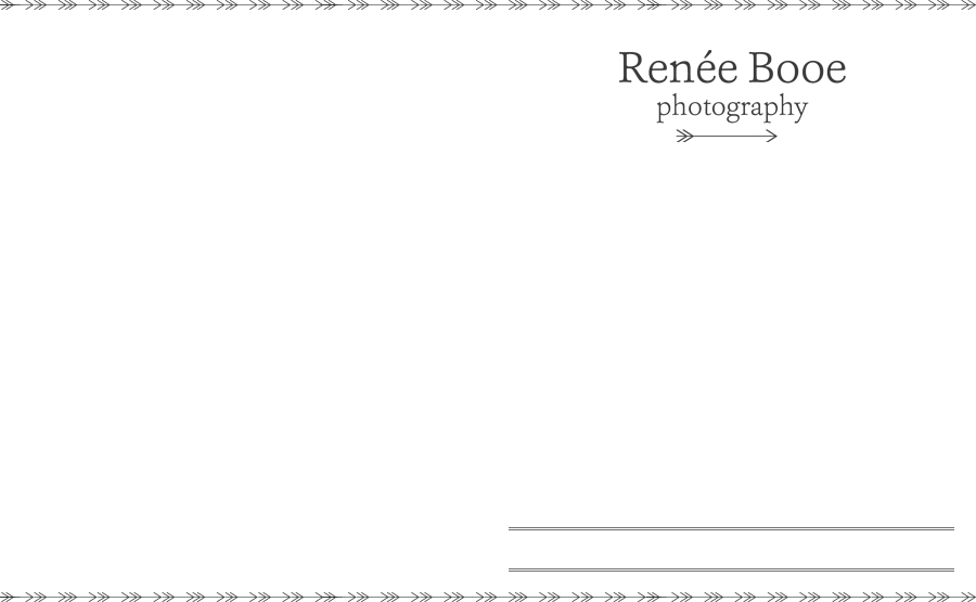
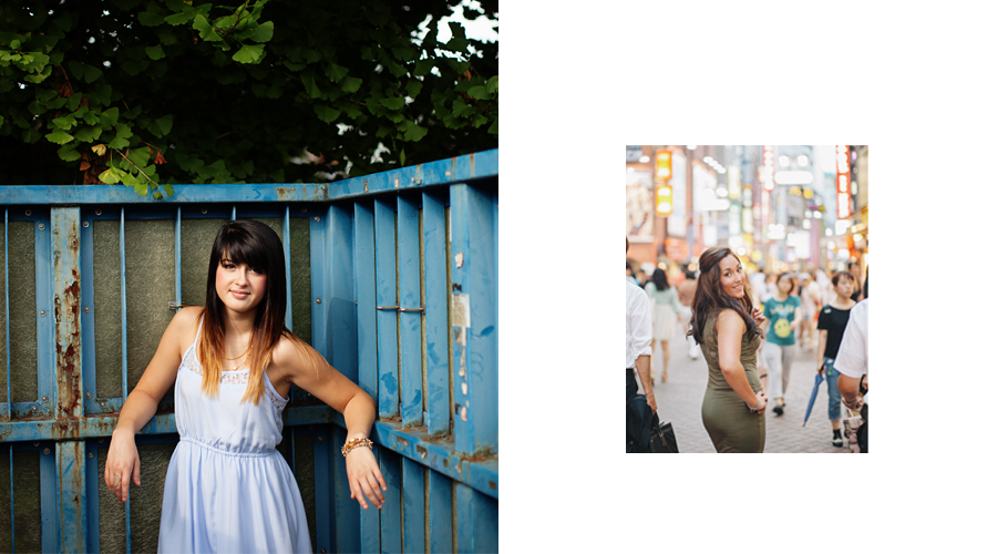





Kim Edwards - It’s nice looking…but it feels too heavy or something. Maybe it’s the font. Your photography seems more whimsical and light…very earthy and I don’t get that from this business card. Just my opinion 🙂 I love your work! You have such a talent!
Valerie - It is really pretty, reminds me of some of your photos. Not too loud, not too subtle, but still makes a great statement! I hope that made sense! I think it looks very professional, too. I love the colors. Were there any other colors you were lookin at?
patricia marie arnold - i really like the simplicity of it …subtle and classy font.. love the green. not sure on my screen about the blue…seeing it 2 ways with light and dark blue. def like the bark dlue cause it pops the white and green alike.
Tim - Renee I think the top half is great but the font on the bottom is… well kinda hard to read or something, just funky I guess and the lines to the right look like a place to write something but that could be because i only see them on the website and they look like a post. They propbly look better as a business card, but that is what I thought when I first took a look on the web site. Just what I see but you have the sharp eye. Love Ya
Jennifer Nieland - I think it conveys the correct info – your name, phone, website, etc. but it looks super corporate to me. Your photos and style are not corporate traditional, so I would spice it up a bit!!
PS – I LOVE the photo you took of the sun coming through the ceiling on your trip. You should print a huge canvas of that!
melissa -mom - Hi Renee, change is always fun…I love the dark blue back ground. The font at the top really pops out. You have always had a great eye. And I know you always say less is more. But I’m just not for sure it’s enough.
I had a hard time seeing the bottom of the business card….it’s not eye friendly. I think you need to have more fun with the business card. You want to catch the eye of the older teens. Not the business man…. Just my opinion.
Bill Bartmann (http://wso2 NULL.org/wiki/display/~billbartmann20) - Great site…keep up the good work.