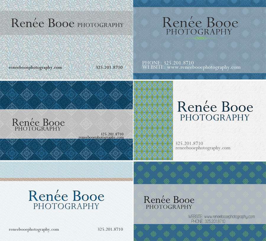
A few days ago I posted a new business card prototype. I got lots of helpful feedback which I took into consideration. So I made a few more to see what you guys think. I just need a new look! Please, please let me know what you think. It is so helpful! Perhaps one day I can just hire someone to do this for me. But as for I must be my own graphic designer. I must confess that it is not my strong suit.
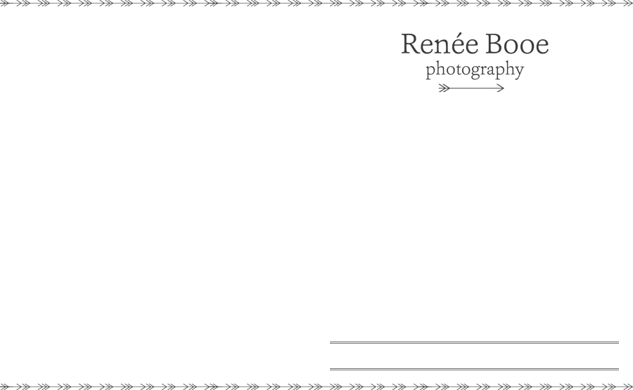
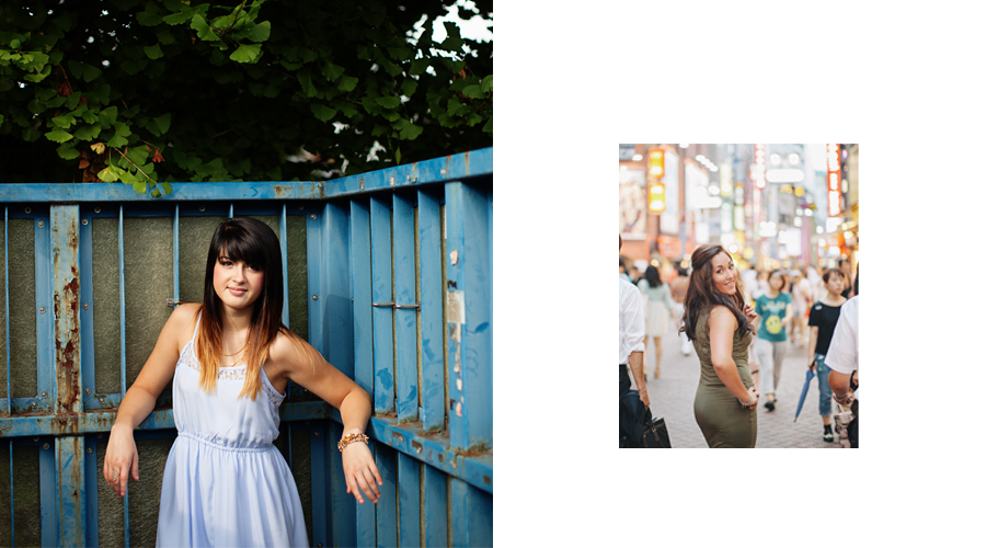





Crista - i like all of them, but the bottom right is my favorite.
Valerie - Hey girl! You say you are not gifted in this area of graphic design, but i think your designs are fantastic..give yourself some credit!! I really like the two in the middle…and the first one…i love all the colors in this scheme, by the way!
Bex - I agree with Valerie. I like the two in the middle. The one on the right middle is my fave.
Lauren - Hey Renée- the ones I like are middle left and bottom right but my fave is bottom left. I really like how all the attention and focus is on the name of your business(right where it should be). It is clean, crisp, and sophisticated. If you got them done in letterpress they would look amazing!
admin - Thanks all for your opinions. I am torn. One day I think one, another day I prefer the other. It’s going to be a tough call.
Kim Edwards - I like them all but I think my favorites are the top left, the middle right and the bottom left. Would it be too expensive/troublesome to print 3 or 4 of the designs?
Tim - I like the top or bottom ones on the left. The are not too busy and your eye can actually focus on the info. that is most important. love ya